Media Studies


Preliminary Task
Preliminary Task
Inspiration
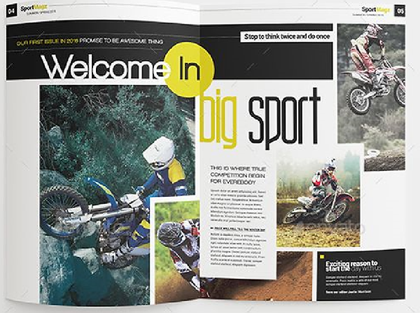
Reference magazines provide crucial help when it comes to designing your own magazine. They provide a benchmark for standards, help find out weaknesses within your own design and provide inspiration for color schemes and layout.
The magazines I mostly used for inspiration were the Business Magazine and Sports Mag Magazine.
Magazine Cover Page

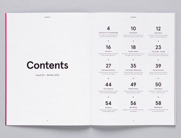
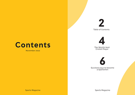
Magazine Content Page
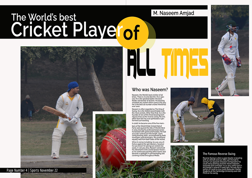
Magazine Article Page
Rough Sketch and Mockup
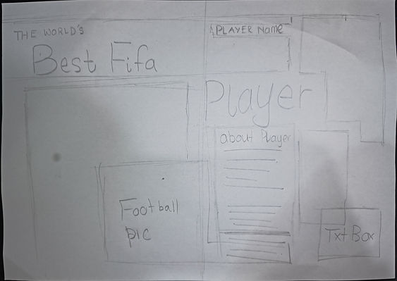
Designing a rough sketch of your magazine is one of the important steps you have to follow before designing the actual magazine. It helps you to highlight any design flaws and prevents you from altering the final design many times, thus saving time. It can even act as a reference guide throughout the designing process.
Magazine Article Page

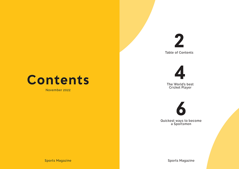
Magazine Content Page

Magazine Cover Page
Photography for Magazine
All the below Photographs have been captured by me


Designing Magazine
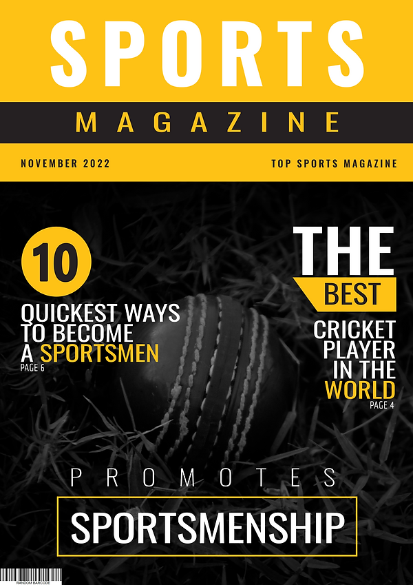
Cover Page
PhotoShop Save File
PhotoShop TimeLapse
Table of Contents
PhotoShop Save File
PhotoShop TimeLapse
Article
PhotoShop Save File
Evaluation of Design
Color is one of the most important key features when it comes to making a magazine more eye catching. It can completely change the entire outcome of branding and advertising. Brands have certain color theme for all their Magazines which allows consumers to recognize the brand just by getting a glimpse of it.
I went with an Orange-Yellow and gray theme throughout my Magazine. I did this because I made a sports magazines and the colors compliment each other. Yellow is a color that evokes feelings of positivity and also gives people feelings of motivation and encouragement. Gray color adds a balance between cool and warm colors. Other than that, it even helps reduce the intensity of yellow.
Secondly, sports is mostly about statistics and numbers. Which is why, I highlighted the "Top 10 quickest ways to become a sportsmen" and "The best cricket player in the world" on the cover page.
Lastly, I have used bold typography along with visually appealing and dynamic images which makes the magazine more attention grabbing and makes the reader to keep on reading the magazine.
In conclusion, the overall design of the sports magazine is visually impactful, with bold typography and visually appealing images used throughout the magazine. The orange-yellow and gray color scheme goes perfectly with the theme and creates a good balance between the cool and warm colors. However, the magazine could have had been much better with improvements to the color scheme and choosing a better font the magazine. Overall, the design has a potential to be much better with some improvements.
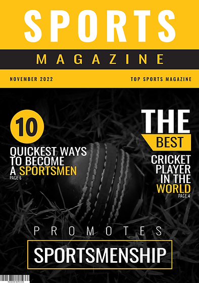
MASTHEAD
SELLING LINE
COVER LINES
MAIN IMAGE
SELLING LINE
DATELINE
BARCODE
Page Number along with Descriptions/Headlines
Learning Outcome
This was the first full magazine I created fully myself without using images from the internet. I would say that the preliminary task resulted in a significant enhancement of knowledge, skill and expertise in the use of photoshop. Other than that, it provided me the opportunity to develop my skills and knowledge in the art of photography and the related accessories/lenses to be used. Overall, this projected gave me the necessary knowhow to undertake research in a professional manner. It taught me how to bring all this knowledge and skills together to design and publish my own magazine. I am now more confident that I can do an even better job in my future projects related to media and publications. All together to bring out professional looking high quality magazines.